2018 U.S. Hate Crimes
An interactive data visualization of the hate crimes in the U.S. in 2018.
Tools: HTML, CSS, D3.js, OpenRefine
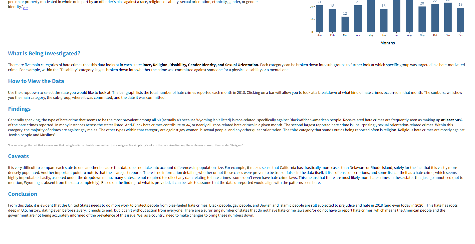
This was my final project for my Data Visualization class I took in my third year of college. The news about George Floyd was all over the media at the time, so I really wanted my final project to highlight data related to hate crimes in this country to see if there were any trends and examine how this data was reported.
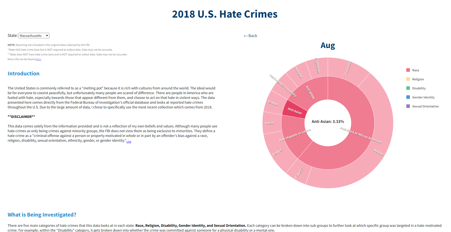
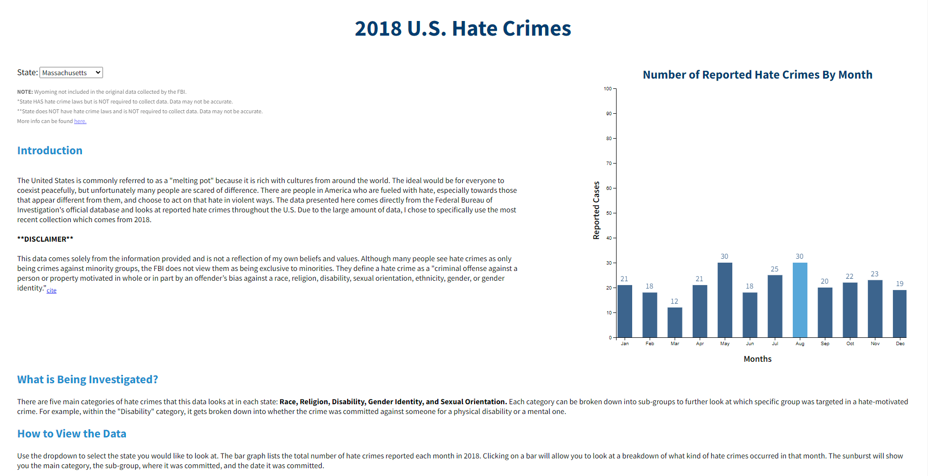
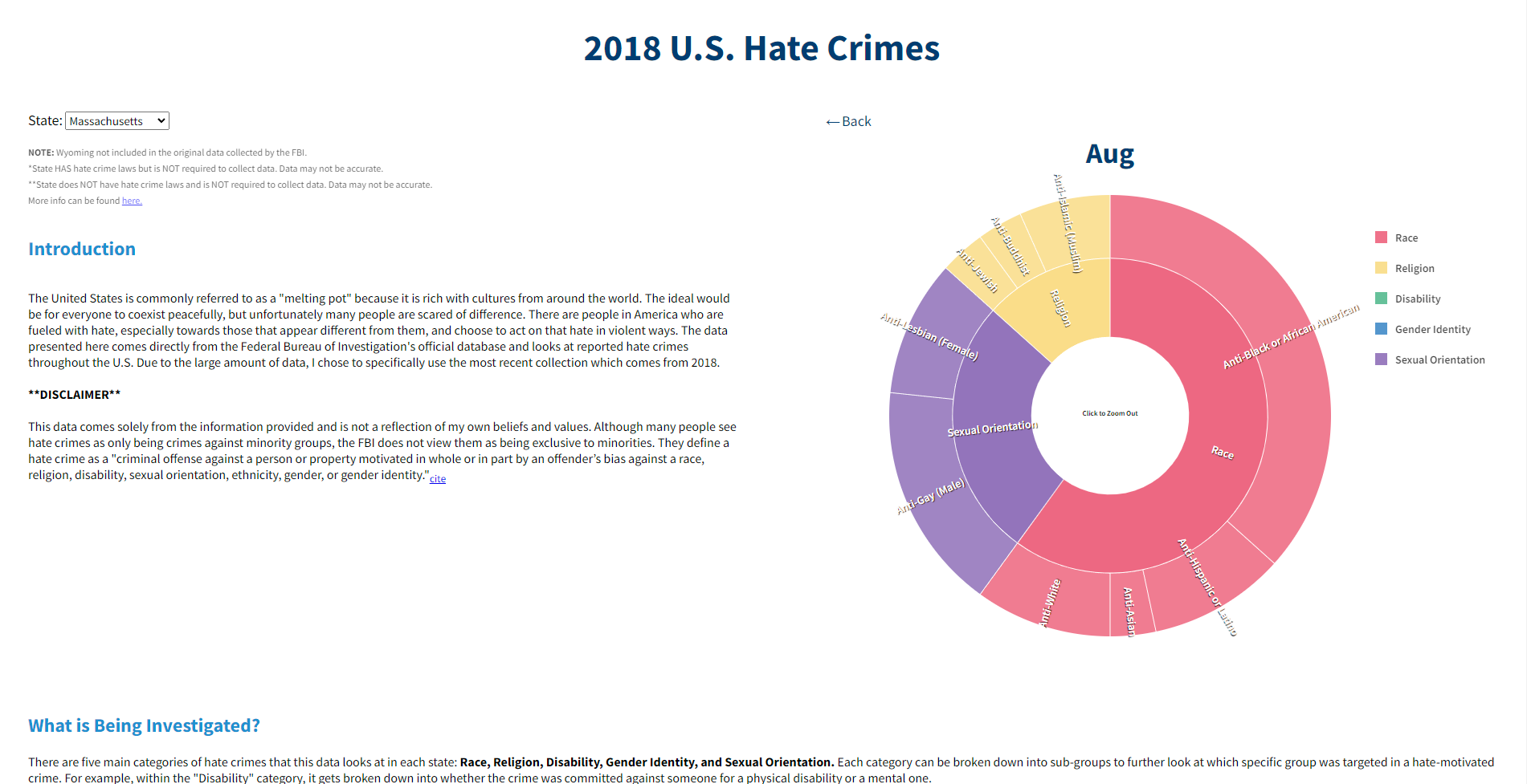
For this project, I grabbed some open source data from 2018 and used OpenRefine to clean it. I utilized the D3.js library to create interactive bar charts that represent the number of hate crimes reported by month in each state. Clicking on one of the bars opens up a zoomable sunburst chart that gives a detailed breakdown of the types of hate crimes committed in that particular month (for that state). Each time a section on the sunburst is selected, the information becomes more specific--showing the subcategory of the hate crime, the location it took place, and the date.
This was one of my favorite projects I completed while at RIT, and it was very intriguing to see the hate crimes that were reported (or, more interestingly, NOT reported) in the U.S. Although it is a few years old, much of the data is still a reflection of today.


